Fiji Hardwood
Case Study
How we designed the UX for the Fiji Hardwood Corporation website
Fiji Hardwood Corporation UX Design Process
We were engaged in August 2023 by Fiji Hardwood Corporation Ltd for the development of their website.
Our initial meeting allowed us to understand the function of FCHL and the target users for its website.
Further branding research, station visits and discussions brought about clarity and reinforced this discovery.
That clarity allowed us to iterate during our design process and make the design decisions we made as shown through this case study.

First Things First
We initially set out to do our branding research.

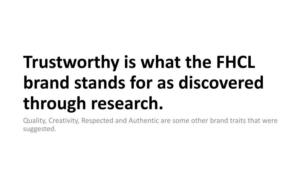
This was to help us get to the heart of what FHCL stood for from an internal perspective. We created a questionnaire that we shared to staff and received valuable insights from their responses. Some of the qualities that came out during research on what the FHCL brand stood for are reflected in the word cloud above.
Most prominent was trustworthy, quality, and respected.
Different questions were posed.
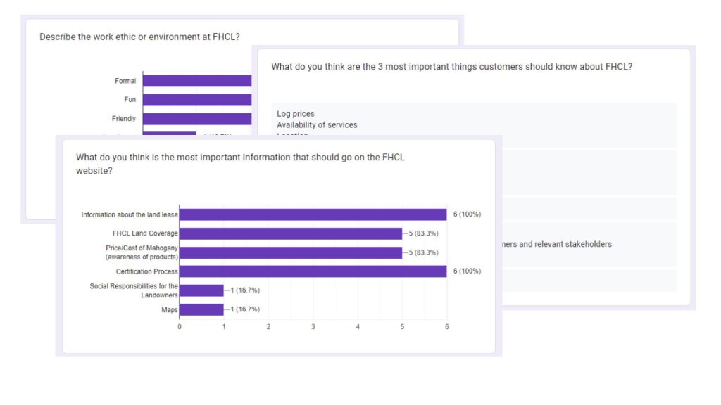
Feedback on the work environment was:
- Friendly
- Challenging
- Family-oriented
- And formal
The one thing that was prevalent among the staff is that they found management approachable. Research showed there is an open door policy and feedback from the staff about management was very positive. This reinforced the brand being Trustworthy.
Client Requests
Here is a list of deliverables the client had requested for this project.
- A modern website with a user friendly interface.
- Responsive and displays well across different devices.
- Fast loading and compatible across different browsers.
- Visible call to action buttons.
- Integrated into a Content Management System.
- Short form video for content.
Identifying User Groups
We received feedback through the form on who the target users were according to the staff.
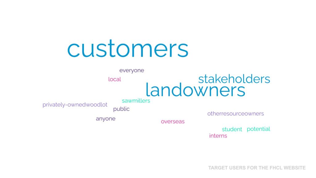
These insights allowed us to iterate during design to address the needs of the customer as our primary user as opposed to the landowners which was the assumption made during our initial meeting.
Drawing Up Personas
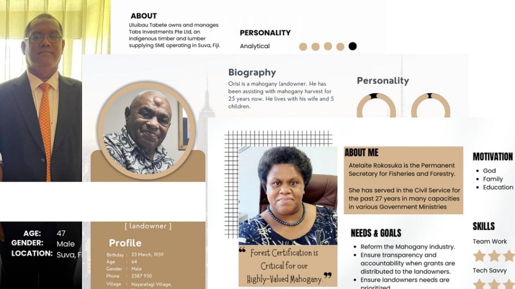
User personas were then drawn up.
Personas are fictional characters based on research that guide design decisions. This research is normally conducted on a group of targeted users to discover insights that shape the overall product design.
We developed three personas based on the target users for the website. One for the customer, the landowner, and government which served as other stakeholders. These personas gave us insight into the user needs, online habits, their frustrations, skills, and goals.
This allowed us to make informed design decisions and put a face on the end users for FHCL
Designing the Information Architecture [IA]
Information architecture (IA) is the structural design of shared information environments; the art and science of organizing and labelling websites, intranets, online communities and software to support usability and findability;
Wikipedia
Information architecture focuses on organizing, structuring, and labeling content in an effective and sustainable way.
The initial information architecture was based on information gathered and structured to address the needs of our personas.
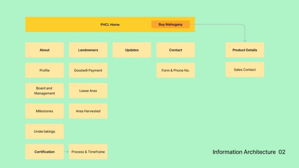
One thing that was discussed was the importance of certification to FHCL and we wanted to highlight this through the information architecture, making certification a top level menu.
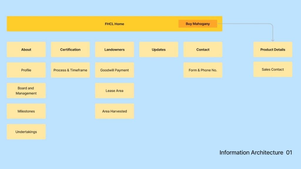
However, upon further discussions and thought, we iterated and moved certification under the about menu item. The reason being was that we didn’t want potential customers to be deterred as FHCL is still in the process of acquiring forest certification.
Final Information Architecture
The final information architecture was drawn up after conducting the design inspiration analysis as we took a page from the Tropic Wood architecture.
One thing that kept coming through during discussions was the importance of sustainability and so this is what became a top level item with Certification (the process, status and timeframe) to go under this menu item.
This decision addressed our primary persona (customers and potential customers) and the separate top level menu for ”Landowners” was to address our landowning stakeholders as well as relevant Government industries.
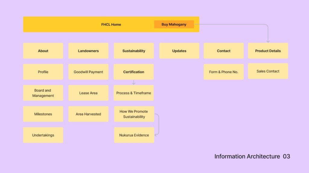
The “Buy Mahogany” button was the call to action on the top level menu that was specifically in place for customers.
Wireframes
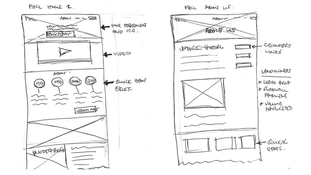
Wireframes allow us to get ideas down fast. These range from low fidelity (rough sketches) to high fidelity (more detailed wireframes).
We love sketching and the important role it plays in getting our ideas down quickly. And this is something we stand by as a UX Design Firm.

Sketching allows us to think through pieces of the puzzle as we begin to construct the whole and iterate quickly based on discovery. Moving things around on paper is way faster and easier than doing it in design and development.
Designing The User Interface [UI]
A user interface (UI) is the space where interactions between humans and machines occur. The goal of this interaction is to allow effective operation and control of the machine from the human end, while the machine simultaneously feeds back information that aids the operators’ decision-making process.
Wikipedia
Fleshing our research and wireframes out into an user interface design that stayed true to the FHCL brand was next.
The question we needed to answer was –
How do you depict trustworthy?
Through clean design, great imagery and concise copy or content to communicate FHCL clearly to its users and potential customers. Content gathering is an important aspect of any project we take on.
Besides going through the FHCL business plan thoroughly and other research conducted, we also went out to take photos and videos for the website and other materials that FHCL may push out in the future.
We engaged and collaborated with Dave Lavaki of First Fighter for our drone shots and footage of the interview with the FHCL General Manager, Mr Semi Dranibaka.
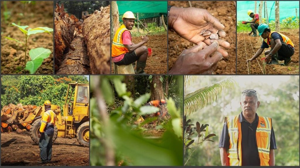
A picture is worth a thousand words and so it was pertinent that we captured great images that revealed, endorsed and enhanced the FHCL brand.
We then derived a color scheme from a few of the images to give us color direction in design.

Home Page UI Design
The final user interface design with all the elements highlighted which satisfied our three personas. The Customer, Landowner and other stakeholders such as Government.
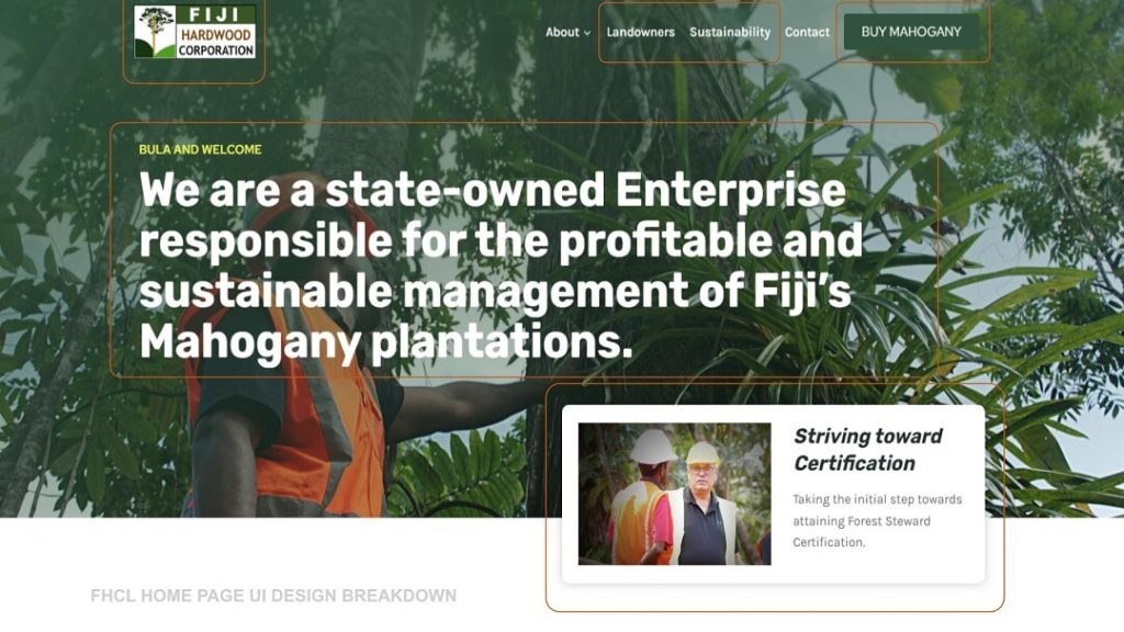
The “For Statement” on a homepage should immediately tell a user
- Who we are
- What we do
- Where we are
- And whether this is for you
And so the initial for statement read “We are a state owned enterprise responsible for the sustainable management of Fiji’s Mahogany plantation.”
The final ”For statement”, written below, was edited based on feedback from the GM on “Fiji Hardwood Corporation” being more prominent on the home page.
We are Fiji Hardwood Corporation, a
state-owned Enterprise responsible for the profitable and sustainable management of Fiji’s Mahogany plantations.
This edit made for a much stronger statement and worked well with search engines.
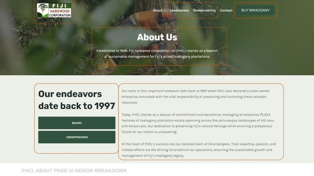
About Page UI Design
The final user interface design for the inner pages with elements highlighted.
A callout on the left with secondary navigation and main content area.
Another prominent discovery that jumped out in the business plan was the reforestation efforts by FHCL. Especially in Nukurua.
Since these figures stood out clearly we took these stats and created highlights that is showcased on the final website.
This further validated and endorsed the strive for sustainability and the certification efforts of FHCL.
Development and deployment
With the UI Design completed the final step was development which is the actual build of the site.
The website was developed into the WordPress Content Management System to allow ease of updates by the client.
We continue to provide technical updates and manage content updates as and when provided by our client.
The website was deployed on the agreed date and the project stayed within budget. We delivered all the client had requested and a finished product that has added tremendous value to their brand.
We have three guiding principles
to our UX Design Process.
Prototype Quickly
Test Early
Break Often
