
REDD+ Pacific
Case Study
Re-Designing the User Experience for the REDD+ Pacific Web Portal
The REDD+ Pacific UX Design Process
We were contracted as Consultants to redevelop the online platform of the SPC/GIZ Regional Programme REDD+ Forest Conservation in Pacific Island Countries which in its Phase II ran from 2015 – 2018.
We worked directly with the Communications Specialist for the Programme, Ms Bernadette Masianini who came with a wealth of experience and knew exactly what she wanted.

First Things First
Primarily we identified the pending problems before we began designing and developing a solution to address them.
Some of the problems stated during our initial meet were:
- Lack of awareness: How to relay information from the region?
- Country engagement and updating
- Internet speed was slower in some Pacific Island Countries
- Device limitation – Field staff will most likely be accessing the site on their phones
Other Client Requests
Some other requests made by the client were:
- To have the main points above the fold on the home page.
- Streamline the information Architecture.
- Keep the Definitions page but make it more user friendly.
- Have related articles or links in the sidebar.
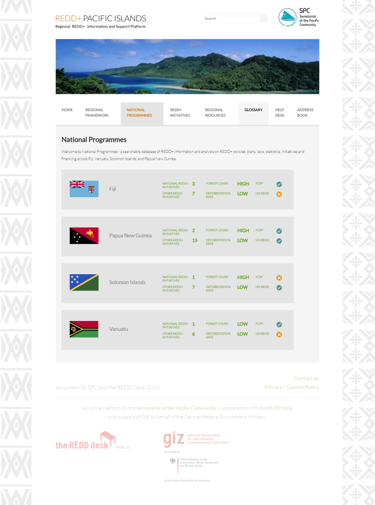
The Old National Programmes Page
Identifying User Groups
The next step was to identify the users which were then separated into two groups.
- Primary User Group
- Secondary User Group
The Primary User Group was prioritized using a rating system based on goals and frequency of visits.
- Senior level public servant – high level overview (4)
- Mid-level directors – more technical side of things…wanting to know the implementations. (1)
- Technical officers (2)
- Field staff – need to understand what REDD does. Majority access their info via smartphones. (3)
Secondary Users were also listed. Immediately our client realized that students would also make up the primary user group due to their frequent usage as learned from her experience.
This caused us to prioritize students as well moving them into the primary user group.
- NGO’s in the Pacific
- Researchers
- Students of regional institutions – students & lecturers active users after information. (3)
- Donors
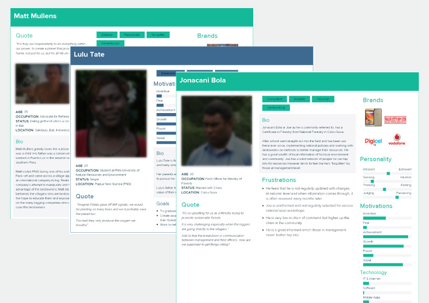
Drawing Up Personas
A persona, in user-centered design and marketing is a fictional character created to represent a user type that might use a site, brand, or product in a similar way.
Wikipedia
The personas, while fictional characters, were fabricated through research of a list of real users in the industry which was provided by our client.
Three personas were drawn up based on the identified primary user groups and research conducted.
- Matt Mullens
An advocate for reforestation. - Lulu Tate
A Student at the PNG University. - Jonacani Bola
A Field Officer for Ministry of Forests
This was done to give us more insight on their specific needs and online behaviour. Design decisions were then drawn from these insights.
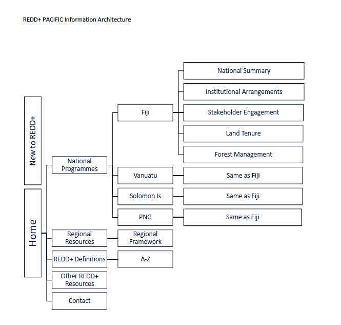
Streamlining the Information Architecture [IA]
Information architecture (IA) is the structural design of shared information environments; the art and science of organizing and labelling websites, intranets, online communities and software to support usability and findability;
Wikipedia
After numerous consultations and exchanges with our client, we were able to streamline the IA to cut the number of pages to about a quarter from the old site architecture.
New Site Architecture
Relevant content were grouped together to minimize click through. The result was a leaner and more focused IA which satisfied the organisations needs and goals for all three primary personas.
Designing The User Interface [UI]
A user interface (UI) is the space where interactions between humans and machines occur. The goal of this interaction is to allow effective operation and control of the machine from the human end, while the machine simultaneously feeds back information that aids the operators’ decision-making process.
Wikipedia
As discussed during our initial meet, the look and feel our client wished to capture for the new site included:
- A Pacific Island feel.
- Pacific Island theme running through – use of motifs.
- Not too conservative or formal – but credible.
- Not rigidly UN type.
- To be User friendly was the main thing.
We got to work designing the new REDD+ Pacific User Interface with all the respective requirements in mind.
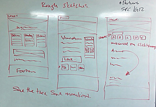
Ideating, testing and iterating through each design phase.
From rough sketches
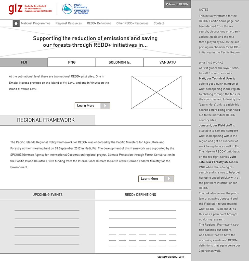
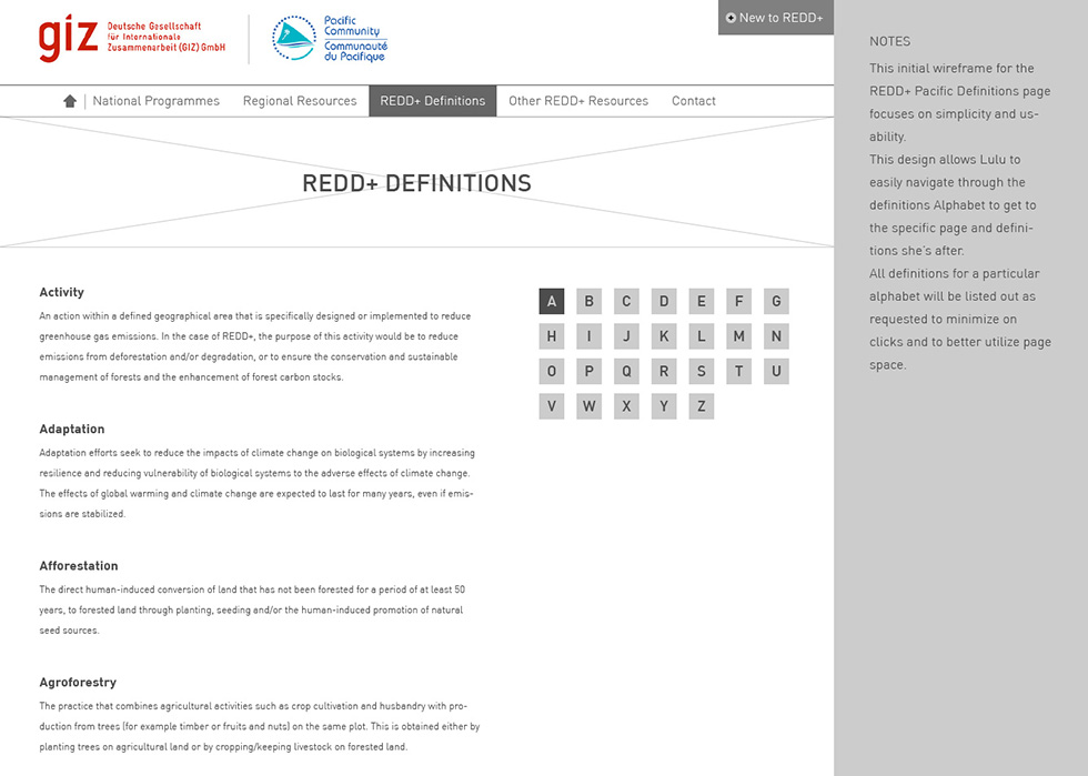
To the Initial Mid-Fidelity Wireframes
A wireframe is a layout of a product that demonstrates what interface elements will exist on key pages.
Designerrs Academy
We drew the wireframes up with annotations on the side explaining and justifying design decisions and how they satisfied their personas needs.
Homepage Wireframe
Definitions Page Wireframe
Iterating and Refining the Wireframes
Country Page Wireframe
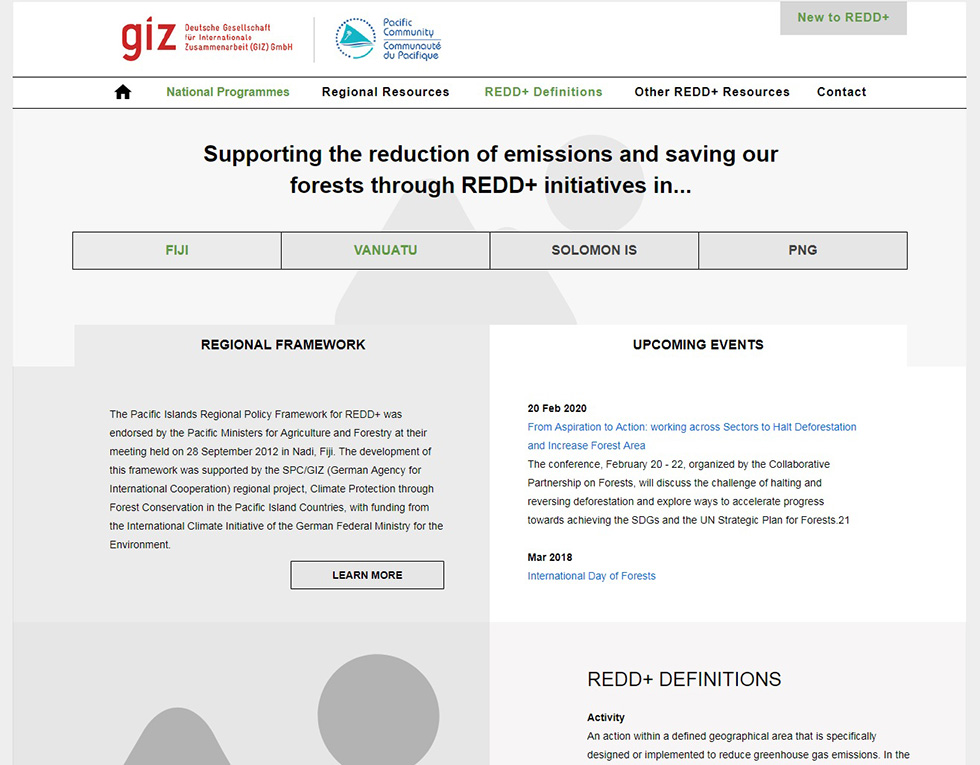
To The Final UI Design
Finding the balance between presenting the right information to satisfy our client’s three personas while adhering to the vision of having a Pacific Island feel was the challenge.
We didn’t want the new UI to appear too cluttered yet needed to maximise the use of space for the desktop version of the site as requested by our client.
Hence, we worked to keep scrolling to a minimum while still providing an overview that satisfied their three personas in the new home page design.
The Home Page Design
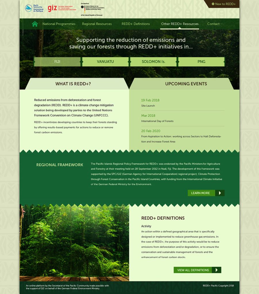
While this was the submitted homepage design, changes were made as per the clients request.
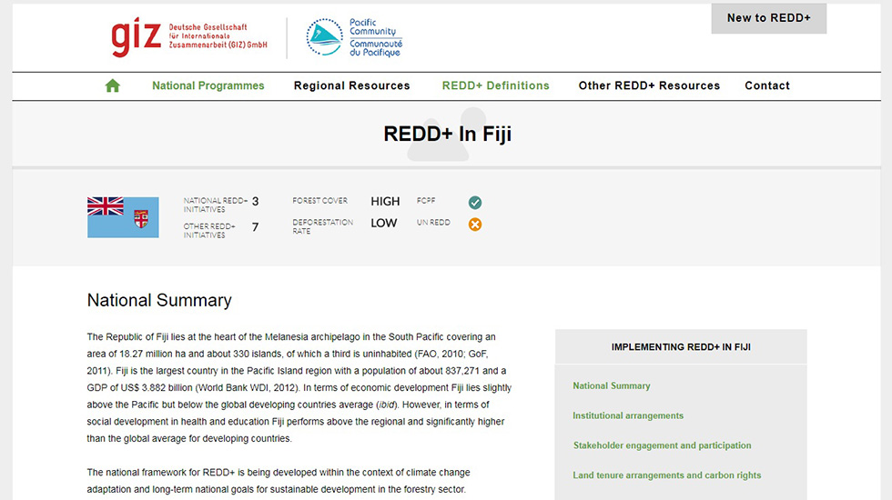
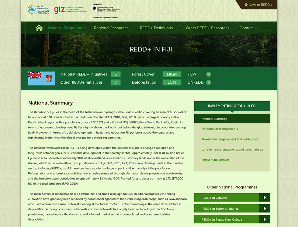
The Country Page Design
We Kept a few elements from the old site design which worked well. These were the quick national stats that we incorporated into the country pages.
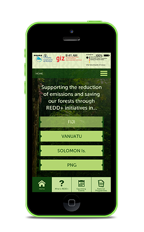
The Mobile UI Experience
One of the challenges that was discussed during our initial meet was that of the devices used by the field staff who would most likely be accessing the site on their phones.
To meet this demand we designed an app like interface for the mobile version of the site to create a better user experience for this segment which was represented by one of the primary personas.
Development and deployment
With the UI Design completed the final step was development which is the actual build of the site.
A custom theme was developed for the site into the WordPress Content Management System to allow ease of updates by the client.
We continue to improve the UX and manage CMS updates on the site, which is hosted by one of our brands, although the Programme term has ended.
We have three guiding principles
to our UX Design Process.
Prototype Quickly
Test Early
Break Often